This weeks topic is Top 5 Title Fonts on Covers. In composing this list I found that I'm not a big fan of the serif, apparently. Well here we go.
Number 5


Anna and the French Kiss
by Stephanie Perkins
I mostly like this font because of its size. I love the boldness of it taking up the entire cover.
Number 4

The Fault in Our Stars
by John Green
I've always loved the handwritten look as you'll see in this and my next pick. This along with the chalkboard, all-caps motif is very visually appealing.
Number 3
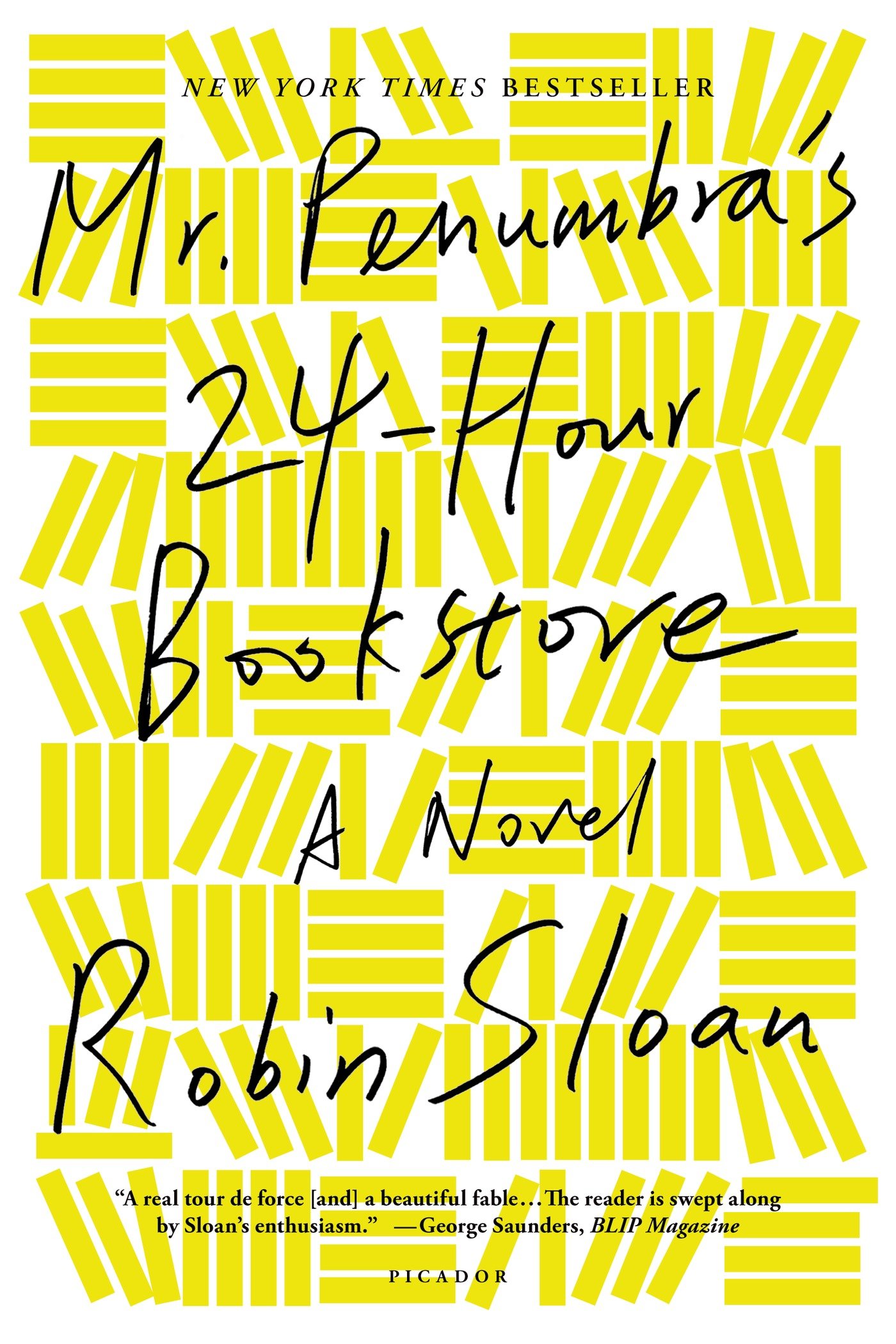
Mr. Penumbra's 24 Hour Bookstore
by Robin Sloan
I love the haphazard look of this title font, like the author was shown the cover right before it was about to go to the printer and they were like... "Robin, we need a title, like, now." So he pulled out a pen and scribbled it on the cover, and they sent it to the printer just like that.
Number 2

Landline
by Rainbow Rowell
I really like the boldness of this font and the cursive font that turns into the phone cord is just adorable.
Number 1
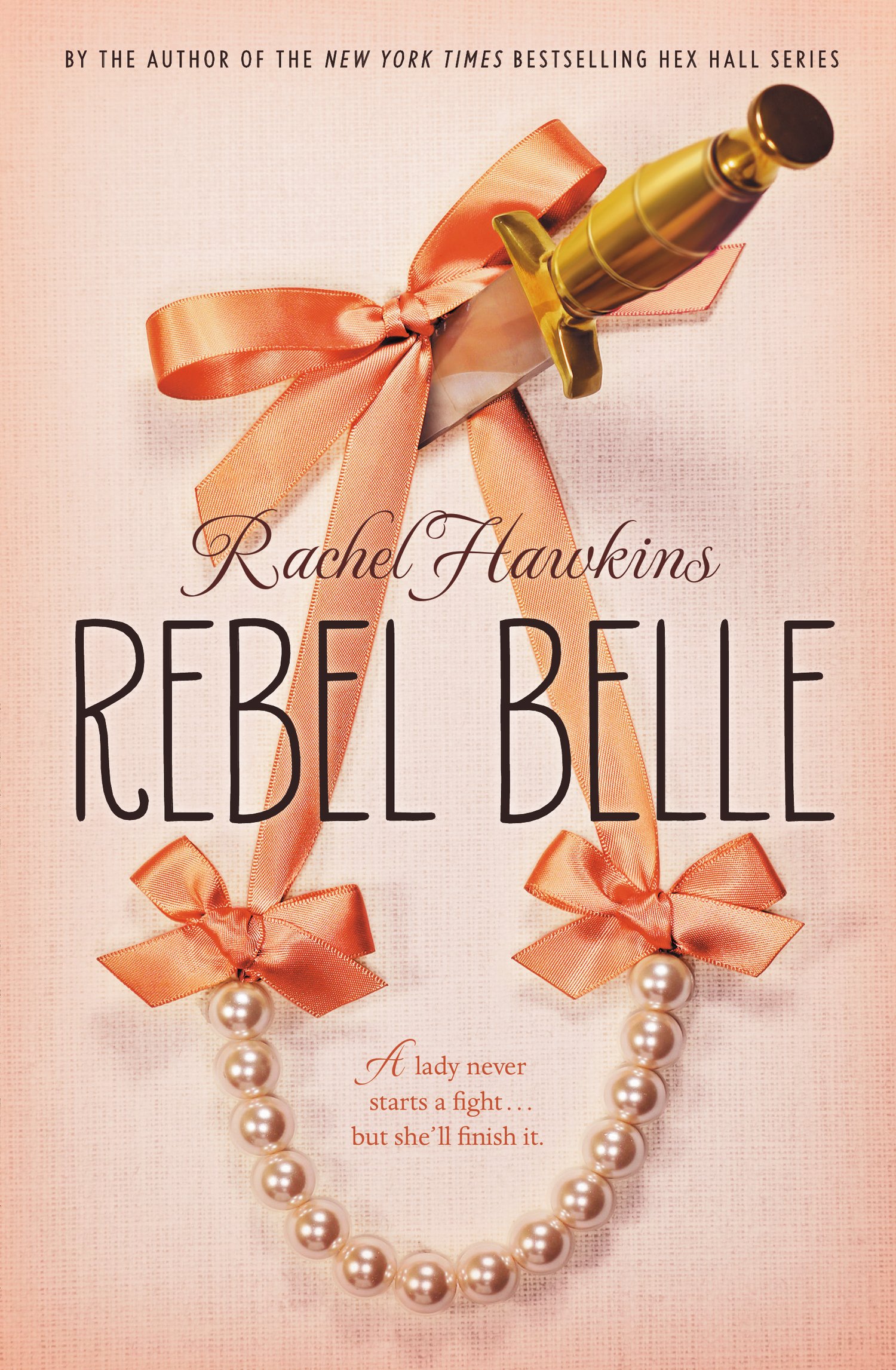
Rebel Belle
by Rachel Hawkins
There is something about this font that just screams southern belle to me. I don't know what it is, but it just does. I especially like the curl in the R. I also like the contrast between the Authors name and the title.
So there is my top 5. What are your favorite book cover title fonts? Share your thoughts in the comments or feel free to link to your own top 5 Wednesday blog/vlog. I would love to read/watch them.
No comments:
Post a Comment